— Case Study 02
The Marshall
Mathers LP
Typography Album Redesign
— Overview
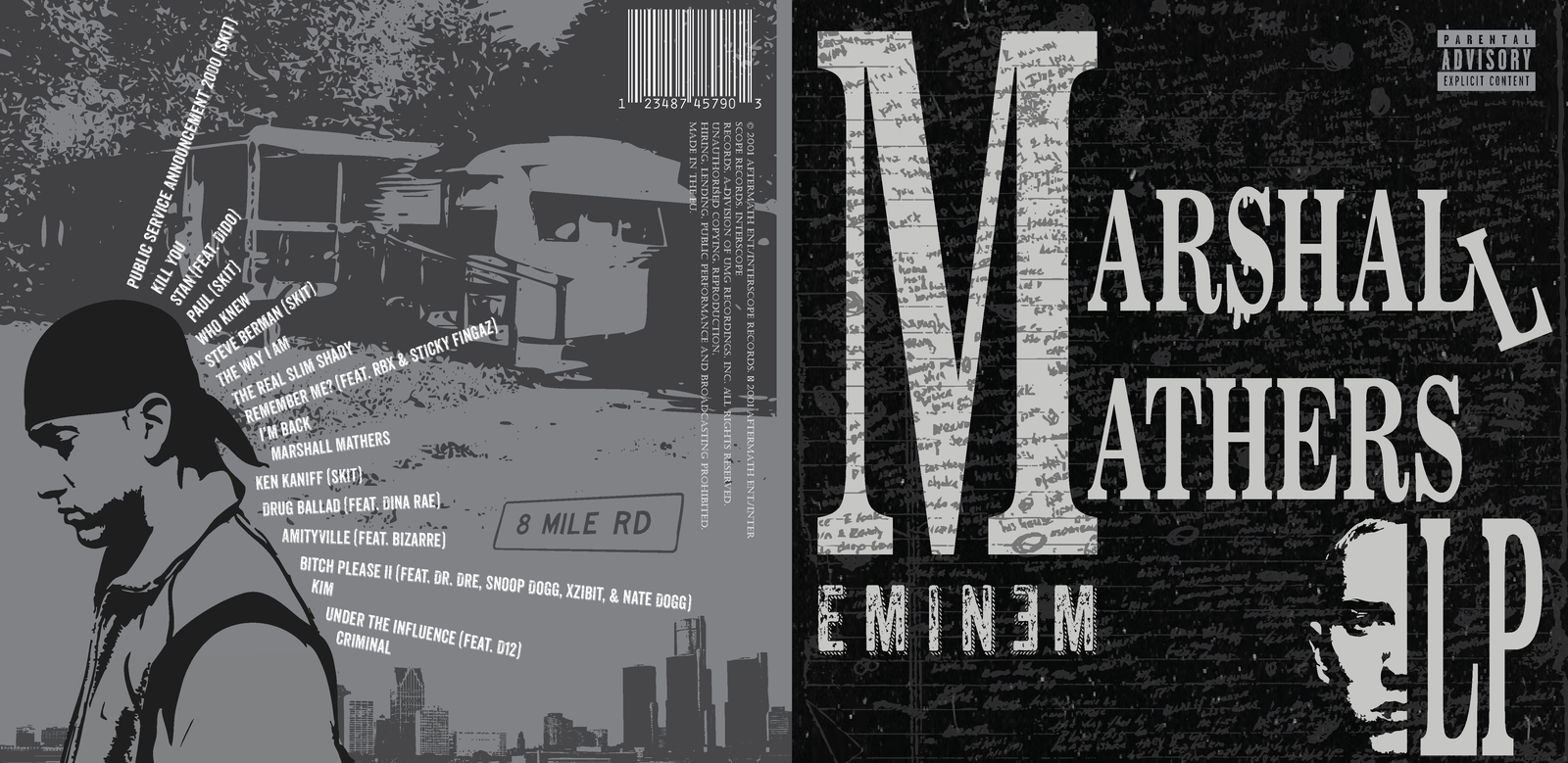
The Problem
The original Marshall Mathers LP focuses more on photography over typography. I wanted to use type to tell the story of the album — to show how typography alone can carry the weight of a record this powerful.
— Research & Insight
The FeelingBehind It
While listening, I felt darkness, emotion, and violence. These feelings drove every decision — from typeface choice to composition.